Social Connectedness and Public Health
Using Facebook data, these researchers explored how geography and historic migration movements impact social networks.
Read Time: 3 minutes
Published:
Social networks shape many aspects of human life, from influencing preferences and labor market outcomes, to facilitating trade and supporting informal markets in developing economies. A number of researchers have studied the relationship between social interactions and health outcomes, with many concluding the positive influence of relationships.
One of the challenges for researchers studying the relationship between social connectedness and public health outcomes is the absence of large-scale, representative data that measure individuals’ social links. We collaborated with Facebook to help overcome this measurement challenge. In particular, we constructed a new Social Connectedness Index that measures the relative strength of Facebook friendship ties between US county pairs.
Given Facebook’s scale, with 2.3 billion active users globally and 242 million active users in the United States and Canada, as well as the relative representativeness of Facebook’s user body, our findings provide the first comprehensive measure of friendship networks at a national level.
In our paper, we explored both the determinants and the effects of social connectedness. For example, Figure 1 shows a heat map depicting the likelihood that a resident of Cook County, IL (largely the city of Chicago), is friends with a resident in all other US counties.

A number of patterns emerge. First, most connections are to geographically close individuals. Second, past migration movements, such as the Great Migration of African Americans from southern states to the North between 1916 and 1970, have lasting effects on today’s social connectedness, as evidenced by the strong links between Cook County and the South. Many other interesting patterns emerge across the United States, linking today’s social networks to past and present migration patterns, and to the social, political, and economic composition of different locations.
While we found that, on average, social connections are primarily local, the geographic concentration of social networks differs substantially across the United States. In some counties, more than 70% of friends live within 50 miles. In others, fewer than 35% of friends live within 50 miles. Figure 2 highlights how the share of friends living within 50 miles varies across the United States.

We find that the geographic concentration of friendship links correlates strongly with a number of important outcomes. Counties with more dispersed friendship networks have populations that are richer and more educated. Interestingly, we also found that the residents of these counties also have longer life expectancies, and lower rates of teen pregnancies.
While these correlations do not necessarily imply a causal relationship between social connectedness and public health outcomes, they do highlight the potential value of using the Social Connectedness Index data to study important research and policy questions. For example, one particularly promising direction for research is to study whether these data can help researchers better predict the spread of contagious diseases.
To facilitate such research efforts, we are eager to share these data with the broader research community. Other researchers interested in working with these data are therefore strongly encouraged to send a one-page research proposal to sci_data@fb.com. For an initial exploration of the patterns, please take a look at the recent visualization by the Upshot team at the New York Times. We hope that the broad accessibility of these data will allow researchers across the social and physical sciences to better understand the many dimensions and implications of social connectedness.
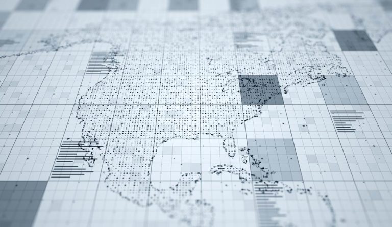
Feature image: StationaryTraveller/iStock. Maps from the New York Times, The Upshot, “How Connected Is Your Community to Everywhere Else in America?, by Emily Badger and Quo Trug Bui, September 19, 2018